Below is a look at the past 30+ years of San Francisco Bay Area real estate boom and bust cycles. Financial-market cycles have been around for hundreds of years, from the Dutch tulip mania of the 1600’s through today’s speculative frenzy in digital-currencies. While future cycles will vary in their details, the causes, effects and trend lines are often quite similar. Looking at cycles gives us more context to how the market works over time and where it may be going — much more than dwelling in the immediacy of the present with excitable pronouncements of “The market’s crashing and won’t recover in our lifetimes!” or “The market’s crazy hot and the only place it can go is up!”
Note: Most of these charts generally apply to higher-priced Bay Area housing markets, such as those found in much of San Francisco, Marin, Central Contra Costa (Lamorinda & Diablo Valley) and San Mateo Counties. (Different market price segments had bubbles, crashes – or adjustments – and recoveries of differing magnitudes in the last cycle, which is addressed at the end of this report.)
Regardless of how recent cycles have played out, it is vital to understand how extremely difficult it is to predict when different parts of a cycle will begin or end. Case in point: In late 2015, when financial markets entered into a period of volatility, IPO activity stopped in its tracks, and high-tech hiring slowed, a well-respected Berkeley economist prophesied there would soon be “blood in the streets” of San Francisco: Median SF house prices have gone up over 20% since then. Boom times can go on much longer than expected, or get second winds. Even when the financial markets enter a period of “irrational exuberance,” that period can go on longer than seems possible, with huge jumps in home and/or stock values.
On the other hand, negative shocks can appear with startling suddenness, triggered by unexpected economic, political or even ecological events that hammer confidence. This leads to other market dominoes falling, the reversal of positive trends in growth, investment and employment, which then balloons into a period of decline, recession, stagnation. These negative adjustments can be of varying scale, in the nature of a crash or bubble popping, the slow deflation of an over-pumped football, or a combination of the two.
Going back thousands or even tens of thousands of years, human beings have tried to predict the future, and whether using priests, oracles, astrologers, pundits, economists, analysts or “experts” of every stripe – and currently having their “authoritative” forecasts headlined every day in the media – we show no aptitude as a species for having the ability to do so with any accuracy. We can’t even remember the mistakes of the recent past – which is one reason why we don’t seem to be able to escape cycles – much less foretell what’s going to happen tomorrow.
Confidence plays an enormous role in financial and real estate markets, and in every period of irrational exuberance, there are many who vociferously argue that the exuberance is NOT irrational. Unfortunately, it can be very challenging to determine the point at which rational confidence shifts into irrational exuberance, but when irrational exuberance abruptly shifts into fear, a stampede for the exits can follow – as an old English saying puts it: “They run all away, and cry, ‘the devil take the hindmost’.” In retrospect, the duration of periods of irrational exuberance, when market gains often accelerate into the stratosphere, seems utterly incomprehensible. Such are the pleasures of hindsight.
All the major recessions in the Bay Area in recent decades have been tied to national or international economic crises, which can take a wide variety of forms. Absent a natural disaster, it is unlikely that a sudden, major, negative, market adjustment (or “crash”) would occur due simply to local issues. However, local issues could certainly lead to less dramatic market adjustments, or exacerbate a downturn caused by a macro-economic event. The SF earthquake of 1989 intensified the national recession that began at that time; our greater exposure to dotcom start-ups did the same with the national dotcom-bubble/Nasdaq crash.
Market Cycles: Simplified Overviews
Up, Down, Flat, Up, Down, Flat…(Repeat)
The chart below graphs ups and downs by percentage changes in home prices at each turning point.
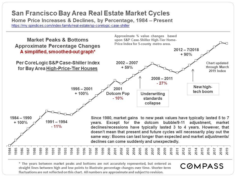
Smoothing out the bumps delivers the simplified overview above for the past 30 years.
Whatever the phase of the cycle, up or down, while it is going on people think it will last forever. Going up, “The world is different now, the rules have changed, and there’s no reason why the up-cycle can’t continue indefinitely.” And then when the market turns and goes down: “Homeownership has always been a terrible investment and the market probably won’t recover for decades” (or even “in our lifetimes” as one Nobel-Prize-winning economist said in 2012). But the economy mends, the population grows, people start families, inflation builds up over the years, and repressed demand of those who want to own their own homes builds up. In the early eighties, mid-nineties and in 2012, after about 4 years of a recessionary housing market, this repressed demand jumped back in (or “explodes” might be a good description) and prices started to rise again. (The dotcom bubble adjustment caused no lasting recession in home values.)
The nature of cycles is to keep turning.
All bubbles are ultimately based on irrational exuberance, runaway greed, criminal behavior or, not uncommonly, all three mashed together. Whether exemplified by junk bonds, stock market hysteria, gorging on untenable levels of debt, a corporate ponzi-scheme mentality, an abandonment of reasonable risk assessment, and/or incomprehensible or dishonest financial engineering, the bubble is relentlessly pumped bigger and tighter. And since human beings appear utterly unable or unwilling to learn the lessons of past cycles, it is kind of like the movie “Groundhog Day,” except that in the movie at least, Bill Murray actually grew wiser over time.
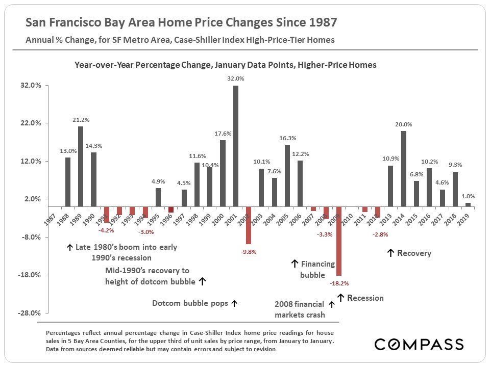
The 2008 crash was truly abnormal in its scale, and much greater than other downturns going back to the Great Depression. The 2005-2007 bubble was fueled by home buying and refinancing with unaffordable amounts of debt on a staggering level, promoted by predatory lending practices, promises of endless appreciation, and an abysmal decline in underwriting standards – and then eagerly facilitated by smug, rapacious, Wall Street flimflammery and self-abasing credit ratings agencies. Millions came to own homes they could never afford to pay for and the rot was distributed throughout the financial system. The market adjustments of the early 1990’s and early-2000’s saw declines in Bay Area home values in the range of 10% to 11%, which were bad enough, but nothing compared to the terrible 2008 – 2011 declines of 20% to 60%.
This is important context when contemplating the next adjustment: It doesn’t have to be a devastating crash. It can be more like some air being let out of an over-pressurized tire instead of a blowout on the highway at high speed. It depends on many different factors.
This Recovery vs. Previous Recoveries
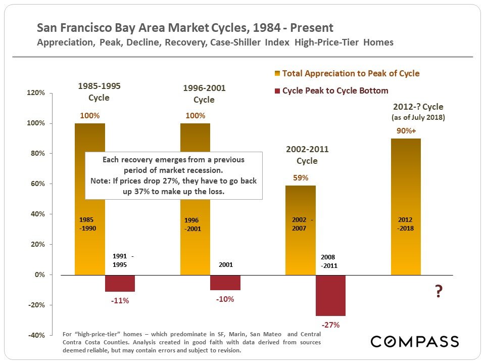
The gold columns above chart the appreciation of past recoveries from the beginning of the recovery to peak value for each cycle (except for the latest cycle, for which the peak has not yet been defined), and the red bars delineate the percentage declines from those peaks, pursuant to the market adjustments that occurred. As always, note that market appreciation and depreciation rates can vary widely by county, community and neighborhood.
Over the past 30+ years, the period between a recovery beginning and a bubble popping (or a lesser adjustment occurring) has run 5 to 7 years. We are currently about 5 years into the current recovery, which started in early 2012 (in San Francisco; later in outlying Bay Area counties). Periods of market recession/doldrums following the popping of a bubble have typically lasted about 3-4 years. (The 2001 dotcom bubble/ 9-11 crisis drop being the exception.) Generally speaking, within about 2-3 years of a new recovery commencing, previous peak values (i.e. those at the height of the previous bubble) are re-attained — among other reasons, there is the recapture of inflation during the doldrums years. In this current recovery, those homes hit hardest by the subprime loan crisis — typically housing at the lowest end of the price scale in the less affluent neighborhoods, which experienced by far the biggest bubble and biggest crash — are appreciating quickly now, and just beginning to re-attain previous peak values. However, communities with higher priced homes — such as in San Francisco, Marin, San Mateo and Central Contra Costa Counties (Diablo Valley & Lamorinda) — have surged well past their previous peaks.
This does not mean that these recently recurring time periods necessarily reflect some natural law in housing market cycles, or that they can be relied upon to predict the future. Real estate markets can be affected by a bewildering number of local, national and international economic, political and even natural-event factors that are exceedingly difficult or even impossible to predict with any accuracy.
As long as one doesn’t have to sell during a down cycle, Bay Area homeownership has almost always been a good or even spectacular investment (though admittedly if one does have to sell at the bottom of the market, the results can be very painful). This is due to the ability to finance one’s purchase (and refinance when rates drop), tax benefits, the gradual pay-off of the mortgage (the “forced savings” effect), inflation and long-term appreciation trends. The best way to overcome cycles is to buy a home for the longer term, one whose monthly cost is readily affordable for you, ideally using a long-term, fixed-rate loan.
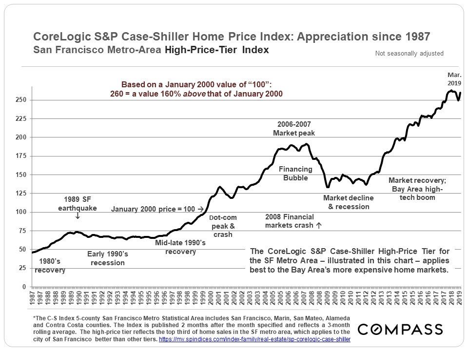
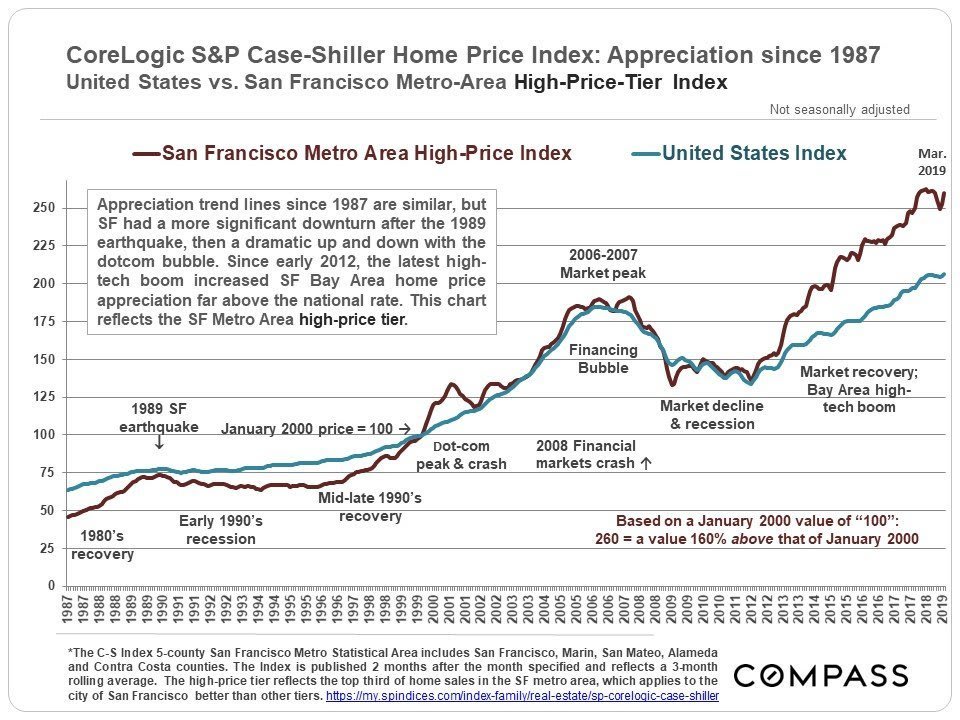
In the 2 charts below tracking the S&P Case-Shiller Home Price Index for the 5-County San Francisco Metro Area, the data points refer to home values as a percentage of those in January 2000. January 2000 equals 100 on the trend line: 66 means prices were 34% below those in January 2000; 250 signifies prices 150% higher.
1983 through 1995
(After Recession) Boom, Decline, Doldrums
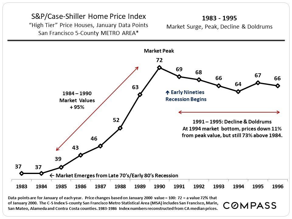
In the above chart, the country is just coming out of the late seventies, early eighties recession featuring terrible inflation, stagnant economy (“stagflation”) and incredibly high interest rates (hitting 18%). As the economy recovered, the housing market started to appreciate and this surge in values began to accelerate deeper into the decade. Over 6 years, the market appreciated about 100%. Finally, the late eighties “Greed is good!” version of irrational exuberance — junk bonds, stock market swindles, the Savings & Loan implosion, as well as the late 1989 earthquake here in the Bay Area — ended the party.
Recession arrived, home prices sank about 11%, sales activity plunged and the market stayed basically flat for 4 to 5 years. Still, even after the decline, home values were 70% higher than when the boom began in 1984.
1996 to Present
(After Recession) Boom, Bubble, Crash, Doldrums, Recovery
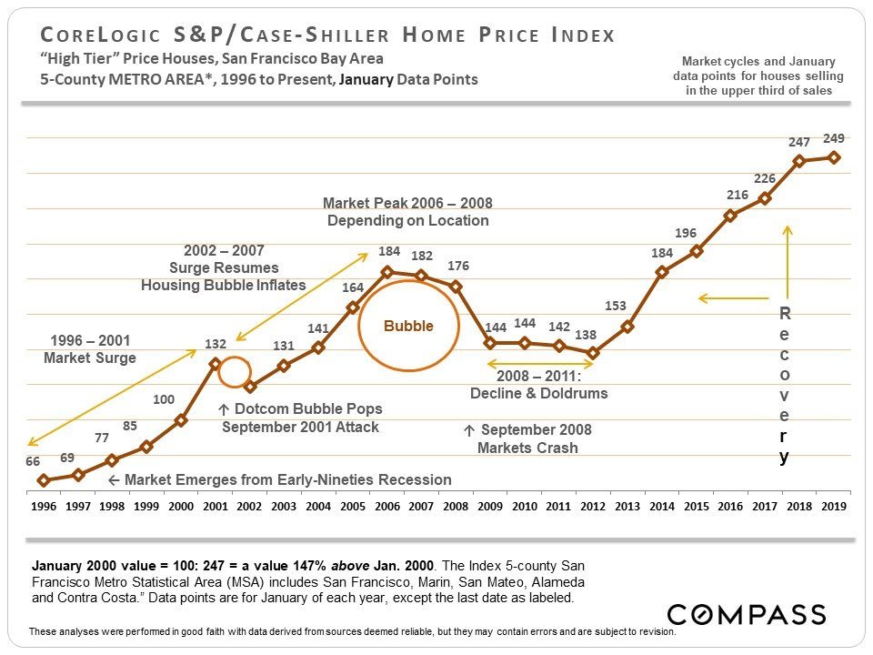
This next cycle looks similar but elongated. In 1996, after years of recession, the market suddenly took off and continued to accelerate til 2001. The dotcom bubble pop and September 2001 attacks created a market hiccup (a short-term 10% decline, but only for high-price tier houses, and for condos), but then the subprime and refinance insanity, degraded loan underwriting standards, mortgage securitization, and claims that real estate values never decline, super-charged a housing bubble. Overall, from 1996 to 2006/2008, the market went through an astounding period of appreciation. (Different areas hit peak values at times from 2006 to early 2008.) The air started to go out of some markets in 2006-2007, and in September 2008 came the financial markets crash.
Across the country, home values typically fell 20% to 60%, peak to bottom, depending on the area and how badly it was affected by foreclosures — most of San Francisco, with relatively few foreclosures, got off comparatively lightly with declines in the 15% to 25% range. The least affluent areas got hammered hardest by distressed sales and price declines; the most affluent were usually least affected. Then the market stayed flat for about 4 years, albeit with a few short-term fluctuations. Tied to a rapidly recovering economy, supply and demand dynamics began to significantly change in San Francisco in mid-2011, leading to the market recovery of 2012.
The Recovery since 2012 (per Case-Shiller)
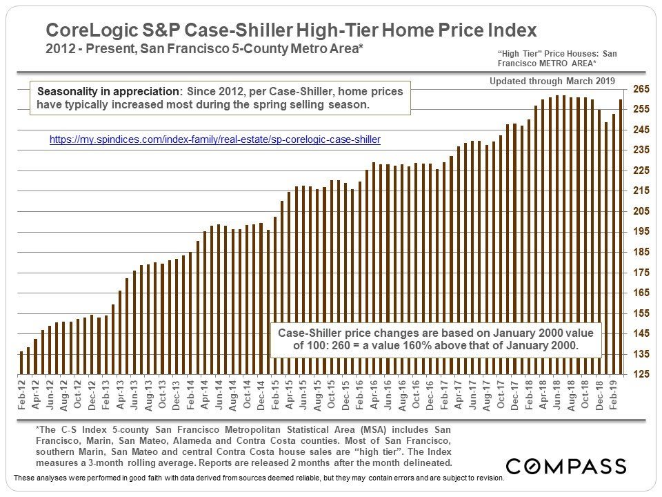
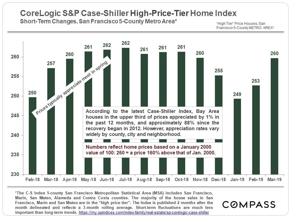
This chart above looks specifically at home price appreciation since 2012 when the current market recovery began. Generally speaking, the spring selling seasons have seen the most dramatic surges in appreciation. It’s not unusual for appreciation to slow or flatten in the second half of the year.
Short-Term Changes – last 13 to 14 months
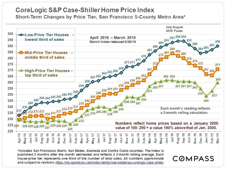
Short-Term Trends by Price Segment (Tier)
In late 2015 and 2016, the greatest pressure of buyer demand started moving to more affordable home segments, as seen in this following chart. In summer 2018, trends started to change, trending down. Then in early 2019, they started to spike up again.
The Panorama: From the late 1980’s to Present
S&P Case-Shiller Index, 5-County SF Metro Area
In the chart below showing percentage year-over-year changes, each January percentage change mostly reflects the market in the previous year, i.e. the January 2002 percentage decline reflects the change in 2001 after the dotcom bubble popped.
Comparing San Francisco vs. United States
Home Price Appreciation Trends since 1987
Really quite similar except for the 1989 earthquake, the dotcom phenomenon, and the recent Bay Area high-tech boom. Of course, the huge difference is in the median house sales prices: The city’s is now over 5 times higher than the national median price.
San Francisco Median Sales Price Appreciation
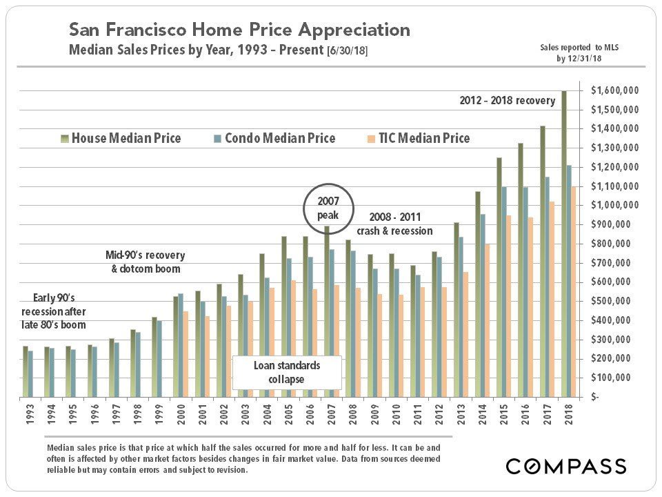
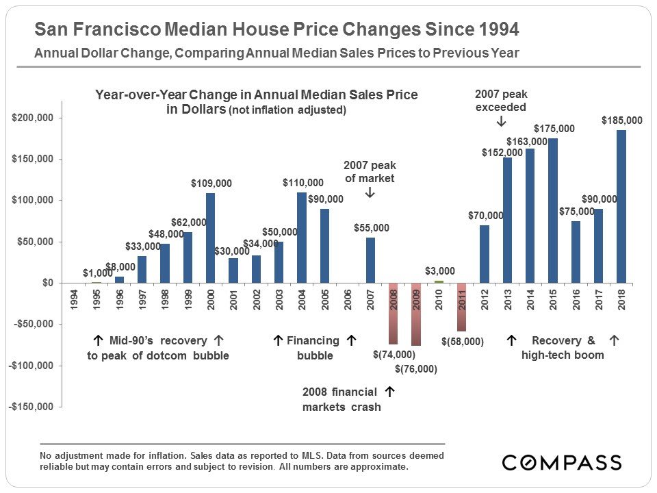
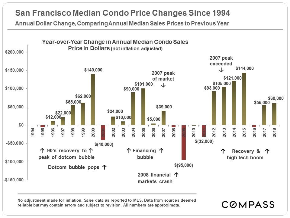
The charts below look at median sales price movements in San Francisco County itself over the shorter and longer terms. These do not correlate exactly with Case-Shiller – firstly because C-S tracks a “metro area” of 5 Bay Area counties, and secondly, because C-S uses its own proprietary algorithm and not median sales prices. Median sales prices are often affected by other factors besides changes in fair market value (such as significant changes in the distressed, luxury and new-construction market segments; seasonality; buyer profile; and so on).
The Current Recovery: 2012 – Present
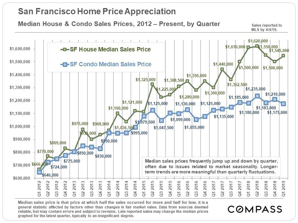
In 2011, San Francisco began to show signs of perking up. An improving economy, soaring rents, low interest rates and growing buyer demand coupled with a low inventory of listings began to put upward pressure on prices. In 2012, as in 1996, the market abruptly grew frenzied with competitive bidding. The city’s affluent neighborhoods led the recovery, and those considered particularly desirable by newly wealthy, high-tech workers showed the largest gains. However, virtually the entire city soon followed to experience similar rapid price appreciation.
San Francisco median home sales prices increased dramatically in 2012, 2013, 2014, and then again in the first half of 2015. In 2016, the SF market clearly cooled compared to the competitive frenzies of previous spring selling seasons, but in 2017 and so far, in early 2018, the market came roaring back again for perhaps its hottest market since 2000. In summer 2018, things cooled down significantly through the end of the year – this coincided with extremely volatile stock markets and sharply rising interest rates. The spring 2019 has been strong, but not as hot as spring 2018. So far, as of April 2019, median prices have not surpassed the highs hit in 2018.
Median Sales Price Changes – Longer-Term: 1993 – Present
Comparing San Francisco, California & National
Median Price Appreciation
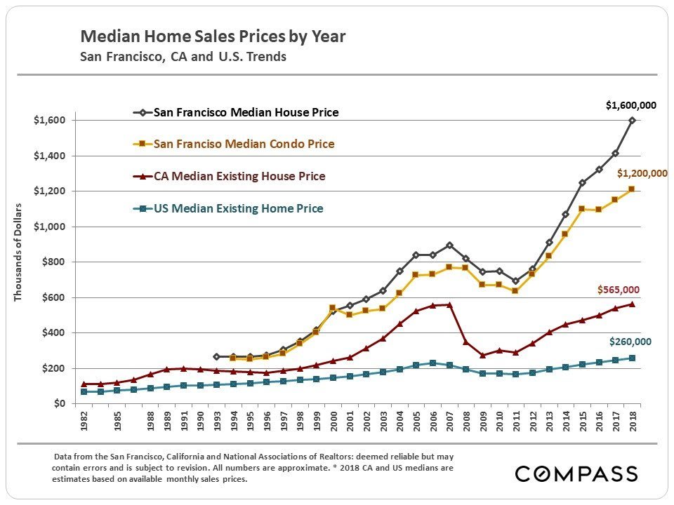
Since 2012, San Francisco has been out-performing the overall state and national markets.
San Francisco Rents
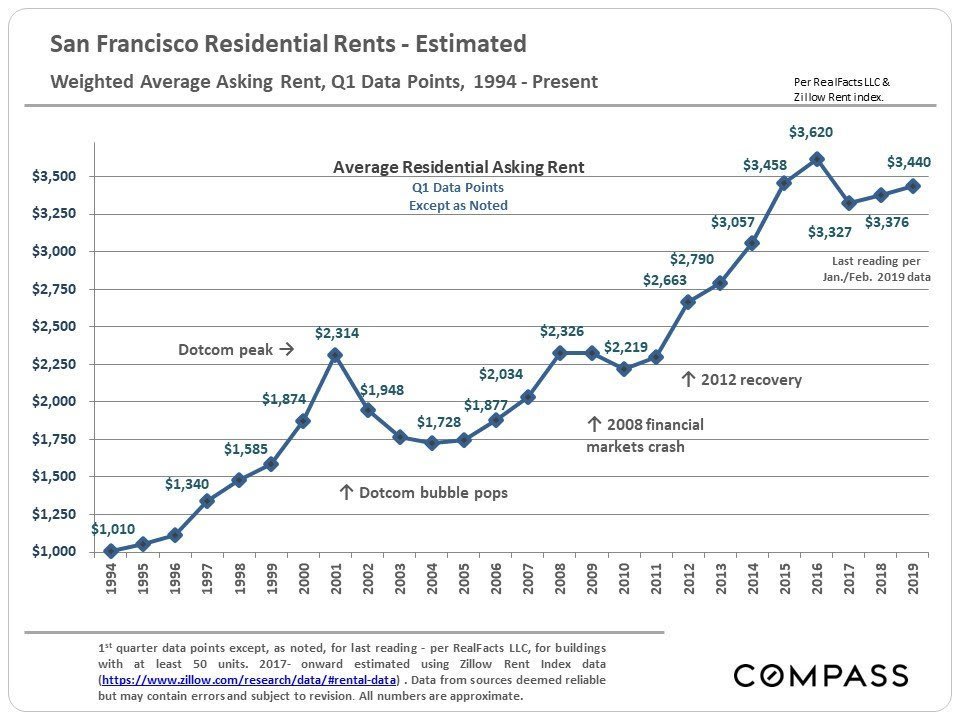
Besides, home prices, home rental rates are major indicators of what is occurring with housing costs and the local economy. If anything, rents have appreciated even more extremely than home prices in San Francisco (and other areas of the Bay Area) – and, of course, renters get no advantages from low interest rates, multiple tax deductions and advantages, or home-price appreciation over time. One classic indicator of an overpriced home market is when prices outpace rents. Recent changes to federal income tax laws limiting the deductibility of state and local taxes (such as property taxes) has played a part in changing the balance between the two.
It’s interesting to note that SF rents actually dropped much further after the dotcom bubble burst than after the 2008 financial markets crash, though the latter was a much more destructive economic event. It suggests that local rents may be more affected by the simple ebb and flow of high-tech hiring and employment than by other macro-economic issues, such as stock market changes. If one loses one’s job and the likelihood of finding another in the area plunges, it may be an immediate imperative to move to a less expensive rental area (pressuring rents lower); if one’s net worth plunges with a stock market crash, one may no longer afford to buy a home (pressuring home prices lower). This is an oversimplification, but may still go some ways to explaining the different scale of reaction by purchase and rental markets to different macro-economic events.
After peaking in 2015, the SF rental market definitely cooled in 2016, with supply increasing significantly with new construction, demand softening (as the high-tech boom temporarily cooled), and rents beginning to decline, especially at the high end. SF asking rents dropped around 8 – 10% from their peaks in 2015. In 2018, some signs of recovery showed up.
Consumer Confidence
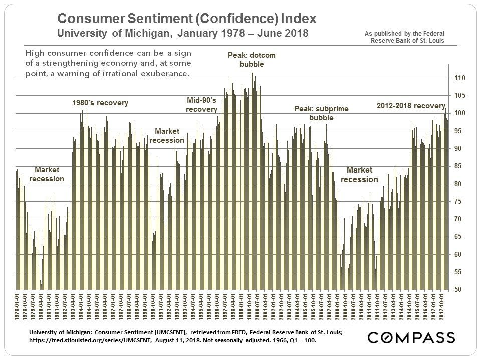
The monthly fluctuations in consumer confidence reported on in the media are relatively meaningless and without context, but longer-term movements are much more meaningful to overall economic trends. Psychology – confidence, optimism, fear, pessimism – often plays a huge role in financial and real estate markets. And events can sometimes turn consumer confidence one way or another very rapidly, whether such movements are rational or not. Generally speaking, pessimism is bad for the economy, confidence and optimism are good, and over-confidence – sometimes called irrational exuberance – is dangerous. It can be hard to draw the line between where confidence moves into irrational exuberance.
Mortgage Interest Rates since 1981
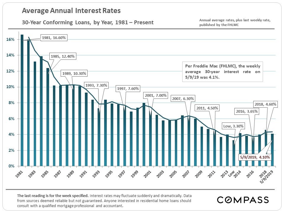
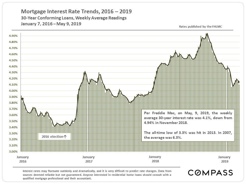
It’s much harder to decipher any cycles in 30-year mortgage rates. Rates remain very low by any historical measure, but have risen since the 2016 election. Interest rates play a huge role in the ongoing cost of homeownership (affordability) and the real estate market. The substantial decline in interest rates since 2007 has in effect subsidized much of the price increases that have occurred since 2011.
Employment Trends
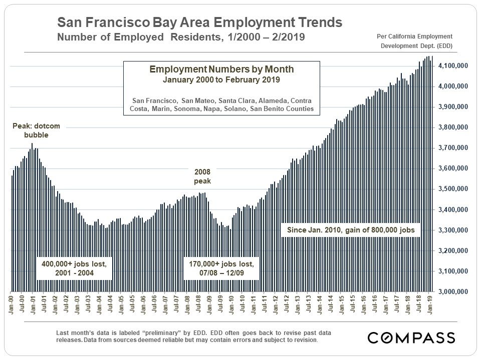
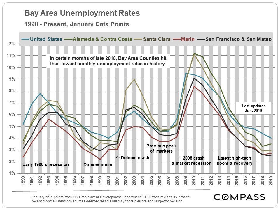
Real estate market cycles have a symbiotic relationship to other economic cycles, such as illustrated in the employment chart above.
Housing Affordability Index (HAI) Cycles, 1991 – Present
for San Francisco & Bay Area, per CA Association of Realtors

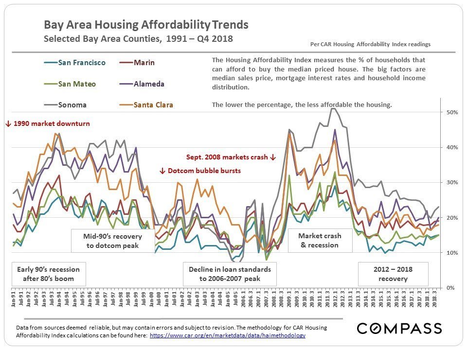
Unsurprisingly, there is a reverse correlation between the trend lines for housing affordability rates and those of real estate price cycles (above). HAI rates jump higher in market recessions, peaking at the bottom of the market, and then decline as the market recovers, bottoming out when peak prices are hit. The lowest Bay Area housing affordability housing index rates (probably in history) were hit in 2007 right before the 2008 market crash (subsidized by buyers taking out loans they could not afford). The Bay Area overall is still above those lows in its current recovery.
The 2008 San Francisco Bay Area real estate crash was not caused just by a local affordability crisis: It was triggered by macro-economic events in financial markets which affected real estate markets across the country. It is important to note that in the past (certainly going back at least 50 years), major corrections to Bay Area home prices did not occur in isolation, but parallel to national economic events (though the 1989 earthquake, which occurred just before the national recession began, certainly exacerbated the local downturn). Ongoing speculation on local bubbles (and predictions of awful upcoming local crashes) often neglect to remember this.
Still, dwindling affordability is certainly a symptom of overheating, of a market being pushed perhaps too high. Looking at the charts above, it is interesting to note that the markets of all Bay Area counties hit similar and historic lows at previous market peaks in 2006-2007, i.e. the pressure that began in the San Francisco market spread out to pressurize surrounding markets until all the areas bottomed out in affordability. This suggests that one factor or symptom of a correction, is not just a feverish San Francisco market, but that buyers cannot find affordable options anywhere in the area. We are certainly seeing that radiating pressure on home prices occurring now, starting in San Francisco and San Mateo (Silicon Valley) and surging out to all points of the compass.
Significant increases in mortgage interest rates – as happened in the second half of 2018 (before then subsiding again in 2019) – affect affordability quickly and dramatically, as interest rates along with, of course, housing prices and household incomes, play the dominant roles in this calculation.
Different Bay Area Market Segments:
Different Bubbles, Crashes & Recoveries
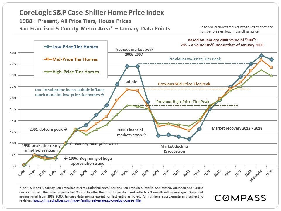
The comparison composite chart dramatically illustrates the radically different market movements of different Bay Area housing price segments since 2000. Farther below are updated individual price charts for each price segment.
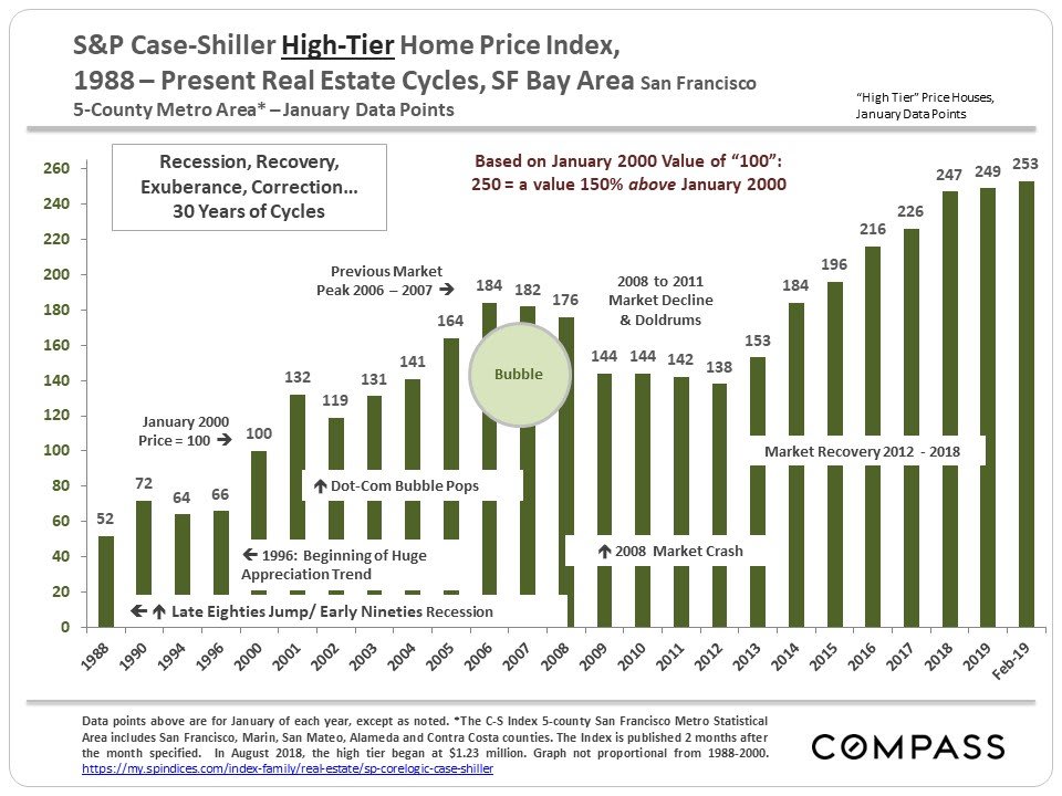
Again, all numbers in the Case-Shiller chart relate to a January 2000 value of 100: A reading of 220 signifies a home value 120% above that of January 2000. The chart above illustrate how different market segments in the 5-county SF metro area had bubbles, crashes and now recoveries of enormously different magnitudes, mostly depending on the impact of subprime lending. The lower the price range, the bigger the bubble and crash. In the city itself, where many of our home sales would constitute an ultra-high price segment, if Case-Shiller broke it out, many of our neighborhoods have risen to new peak values. Updated C-S charts for each price segment are below.
Since mid-2016, the low-price tier has begun taking the lead in home price appreciation.
Updated Case-Shiller Price-Tier Charts
Low-Price Tier Homes
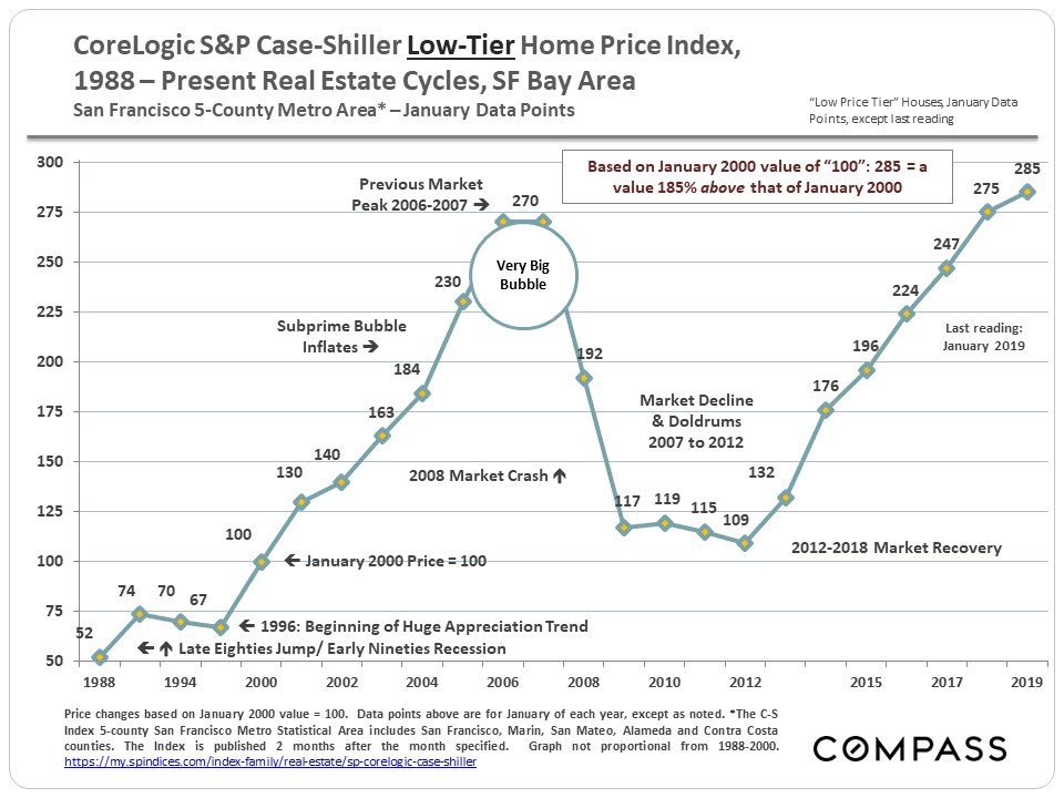
Huge subprime bubble (170% appreciation, 2000 – 2006) & huge crash
(60% decline, 2008 – 2011). Strong recovery, now slightly above previous peak.
Mid-Price Tier Homes
Smaller bubble (119% appreciation, 2000 – 2006) and crash (42% decline)
than low-price tier. Strong recovery has put it significantly over its 2006 peak.
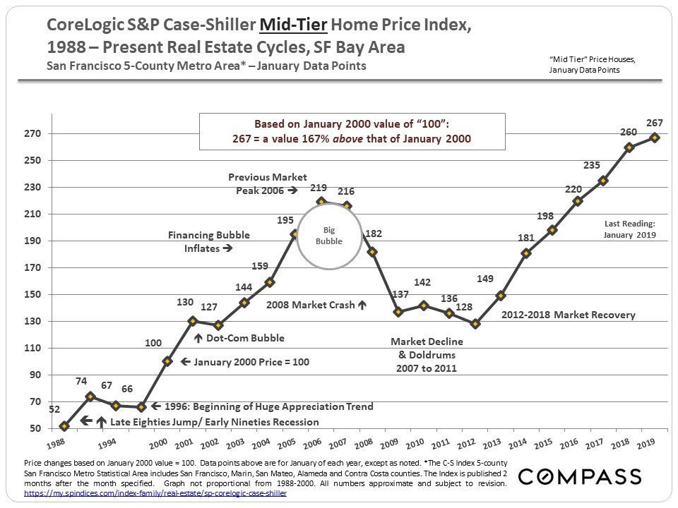
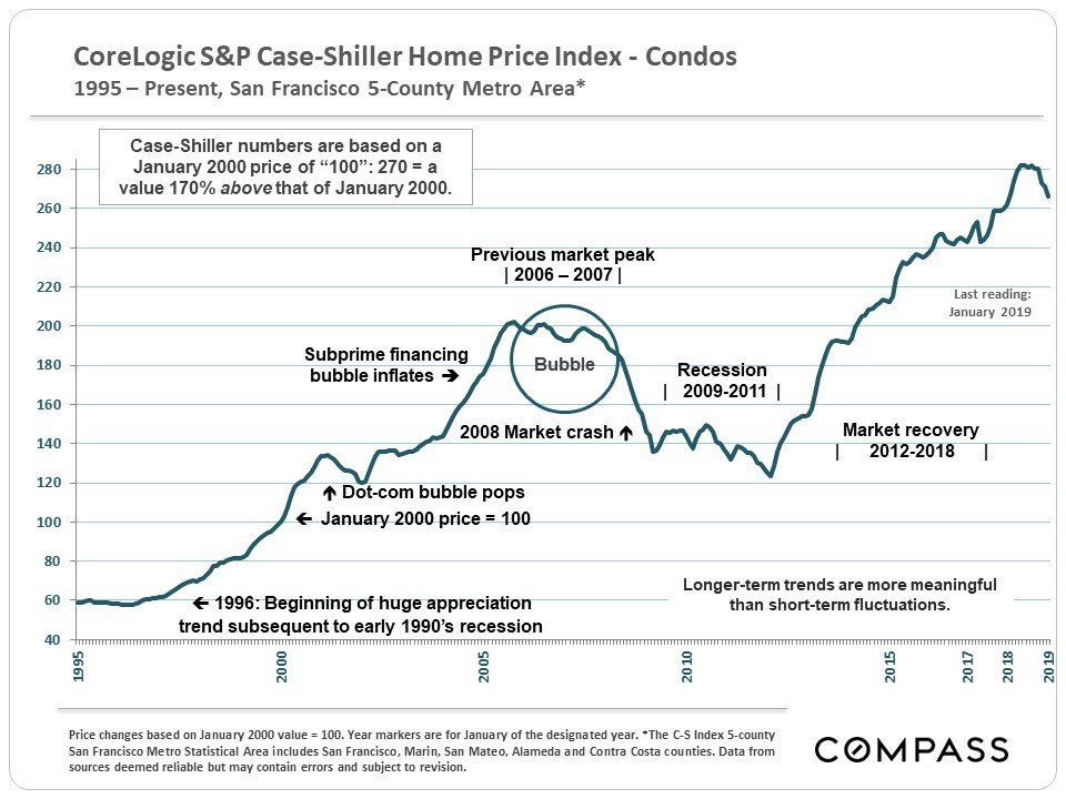
It is interesting to note that the low and mid-price house tiers basically shrugged off the dotcom bubble popping in 2001, while the high-price house tier and condos (and apartment rents) saw significant declines. This is another example of how difficult it can be to make big, general pronouncements regarding the entire Bay Area market.
High-Price Tier Homes
84% appreciation, 2000 – 2007, and 25% decline, peak to bottom.
Now far above previous 2007 peak values.
Bay Area Condo Values
Other Compass San Francisco Bay Area real estate reports with market conditions, trends, home prices and appreciation rates:
- San Francisco Real Estate Market Reports – Compass
- Santa Clara County Real Estate Market Reports – Compass
- San Mateo County Real Estate Market Reports – Compass
- Marin County Real Estate Market Reports – Compass
- Oakland, Berkeley, Piedmont, Alameda: Real Estate Market Reports – Compass
- Diablo Valley & Lamorinda Real Estate Market Reports – Compass
- Sonoma County Real Estate Market Reports – Compass
- Napa County Real Estate Market Reports – Compass
- Tri-Valley, Pleasanton Region Real Estate Market Reports – Compass
- San Francisco Neighborhood Home Prices – Compass
- 30 Years of Bay Area Real Estate Cycles – Compass
- Angles on Bay Area Real Estate – Compass
- Seasonality in the San Francisco Real Estate Market – Compass
